How To Create An Effective Landing Page That Works
Last Update : 23 August 2022
Introduction
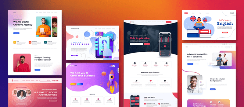
Landing sites are frequently visited while you navigate and surf the internet. Landing pages are tremendously powerful tools in a company’s digital marketing strategy. These are often the first impressions a customer builds about your company or product.
Find excellent landing page design tips in this blog. Learn all about creating an effective landing page that really does its work – engage customers and help them interact with your company. Find tips for good website design and landing page design in this blog.
Landline Page: What is this?
These are the pages that a customer “lands on” by clicking a link on any source, from a third-party blogging page to a Youtube channel description.
Whatever method you use to “land,” a landing page should provide the relevant information in the most interesting manner.
There are many web design tips and tricks that will give the right insights to create effective landing pages. We have included the tips for good website design and landing page design tips in this blog.

Typical Landing Page Types:
Sales Landing Page: A landing page referred to as a “sales page” is intended to turn website visitors into paying clients. They accomplish this by incorporating aspects of the website that compel visitors to act.
Splash Landing Page: A single page called a landing page is developed to achieve a conversion objective. The screen that appears when you first access a website is called a splash page. Unlike a landing page, which loads after a user submits a form, a splash page introduces your website.
Click-Through Landing Page: As its name implies, a click-through page is a doorway a visitor must go through before converting.
Lead Capture Landing Page: An optimized lead capture form distinguishes a lead capture page from other post-click landing pages. You may use this form to gather leads for your offerings and nurture them via your marketing funnel.
Paid Ad Landing Page: A paid ad landing page is an independent website you plan to utilize in a sponsored promotion on AdWords, Bing Ads, or a comparable platform. After tapping through with a pay-per-click ad, users “land” on a specific website.
Referral landing page: By outlining the benefits of joining your referral program, the referral landing page persuades visitors to do so.
Why is a landing page necessary?
You’ll most likely be able to respond to those queries after reading this article. Still, the quick response is this: By removing navigation, competing links, and other options, a landing page removes distractions and allows you to engage your visitor fully.
Complete focus also enables you to direct your visitor to your lead form, where you want them to end up. In conclusion, landing pages are created expressly to generate conversions.

Tips To Create Landing Pages That Bring Great Results:
We’ll go over these best practices for landing pages.
1. Choose A Simple Layout:
You might be surprised to learn that most people don’t read your artfully written material from beginning to end. Instead, they quickly scan and highlight the most crucial information. To ensure that your visitor doesn’t miss anything crucial, you should make such details stick out.
That implies several things are:
- Don’t require your visitor to scroll to see the most crucial information by keeping it above the fold.
- Run a blink test on your page, which means a visitor should be able to understand the core message in less than five seconds—the time it takes them to blink.
- Make advantage of white (or unfavorable) space to maintain your visitor’s attention and help them understand your content.
- Use bullet points and brief paragraphs to make your writing easier to read.
- Try to incorporate the crucial text into the F-pattern, which is how internet users often scan a page. Utilize visual patterns to your advantage to guide viewers to the informational hubs that will convert them.
2. Neat, Clear Minimalist Design:
Your landing pages must be responsive to fit every viewing experience, like any page on your website. Because that would be bad, you don’t want your form to disappear on mobile devices. No matter how they see your page, provide visitors every chance to convert.
Your landing page’s sole and exclusive goal is to turn visitors into leads. Remove all other links from the page to ensure every visitor sees your call to action.
3. Headline That Sells
At least seven visitors to your landing page will leave it for every ten who arrive. Your guests must know the benefits they come with if you want to keep that number low. The importance of any landing page and deal should be communicated in your title, which they will read first.
4. Include Superior Visual Images:
Yes, you must have an image that reflects your intended audience. Your image should show how your client will feel after receiving your offer because its function is to elicit a sensation in the viewer. It’s usually a good idea to split-test your selections because some photographs might perform better than others.
5. Well-Crafted, Visible Call-To-Action:
The call-to-action (CTA) is one of many factors that stimulate conversion and is thus perhaps the most significant feature on your landing page. Make sure the CTA button stands out by using a color contrasting with other page components.
6. Include Trust And Branding Symbols
They exist to assuage your fears that the business or website you are providing the sensitive information to will keep it safe. Theoretically, once you see these on a landing page, you should feel at ease submitting your information and completing the form.
7. A landing page’s colors
Your landing page’s layout should match your website, including your chosen colors. Visitors to your landing page must become accustomed to your branding’s distinctive colors and design if you hope to establish a long-lasting relationship with them.
The parts of your page that need to stand out, like your CTA button, are where you should consider employing alternate colors. Here, contrast is the key to success. Say your company’s primary colors are green. You should pick a hue that can catch users’ attention, like purple.
Remember to include a page of gratitude:
You could display a thank-you message on the same page or omit the thank-you entirely, but that is not the ideal course of action for various reasons.
A thank you page fulfills three crucial functions:
- It fulfills the promise you made regarding the offer (typically in the form of an instant download)
- It gives you the chance to introduce your new lead to add pertinent content
- It allows you to express gratitude for their attention, which can help you sell them to future clients.
Conclusion
We would like to conclude with these three points:
- 1. Landing pages serve as the focal point for marketing and advertising initiatives, assisting companies in generating leads and sales.
- 2. Every landing page emphasizes just one call to action.
- 3. Making a landing page doesn’t need you to have your website.
You need the services of web design who know the best practice for landing pages to create pages that are optimized for conversion. Expert web designers will offer the most relevant and inspiring web design tips and tricks to help you build landing pages that give the best outcomes.
Språk Design
Språk Design delivers services to businesses worldwide. One of the most significant companies offering web design services is Språk Design at the moment.
The company helps in developing a brand’s identity and strengthening it, with media planning and branding strategy, logo design, brand collateral design, and online branding campaigns.
Contact us and find out all about the best landing page design tips for your website.


