Best Tips for Designing Eye-Catching Flyers to Engage Your Audience
Last Update : 25 November 2022
Creating an eye-catching flyer is a lot easier than you think! Flyer design tips can help you save time and still create an engaging flyer. Flyer design tips can make designing easier and more affordable! Whether you’re using a DIY flyer maker or have decided to pay for professional help by hiring business flyer designer. These flyer design tips will give you some ideas on how to create an eye-catching flyer, while saving money in the process.
Seven Great Tips For Designing Attractive and Engaging Flyers
1. Excellent Typography-Readable, Clear, Neat
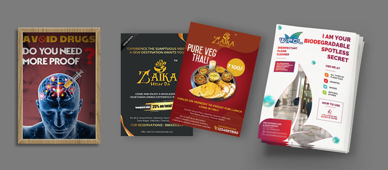
Clear and neat fonts are also imperative for good readability; Arial or Times New Roman fonts are both excellent choices.
Excellent Typography-Readable: Don’t use more than two fonts in any given flyer, as this creates an unclear message and clutters the piece.
Clear and Neat: White space is an important element when designing a clear message; don’t let too much information overwhelm you or your potential customers. Use three columns to divide up the text and give yourself plenty of white space. You should leave some white space on the edges of your flyer so it’s not overcrowded with information.
2. Layout That Allows Black Spaces and Good Messaging Styles
Whether you are designing a flyer for an upcoming event or selling goods, having a layout that allows black spaces and good messaging styles will create a visually pleasing message.
A good layout should allow enough white space on each side of text so that readers can easily follow along. It should also include minimal distractions and not try to get in front of what you are trying to say or sell. Use high quality graphics, have easy navigation links and think carefully about your font styles and sizes. They can make a big difference.
3. Color Scheme That Enhances Visual Identity
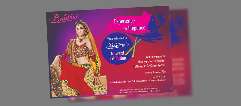
Choosing the correct color scheme is a critical step in making an impactful flyer. Colors evoke emotion, elicit deep and complex reactions, and can work together synergistically or antagonistically depending on the use of complementary colors. If you are looking for flyer designs to help set up an event such as a party or concert, a color scheme that enhances visual identity is best. Mixing vibrant colors like purple, pink, red, and green with black creates a moody atmosphere that will make your flyer stand out. Another way to make sure your visuals pop off the page is by using contrasting warm and cool tones like orange versus blue or yellow versus violet.
4. Experiment With Use of Gradients and Hues
There are a variety of techniques you can experiment with when designing flyers. These can include experimenting with use of gradients and hues. For example, if you have an image of two flowers in front of a sunset, it may be better to use a light gradient on the sunset so that it is not too overwhelming for the other elements in the flyer.
The objective is to balance all the different elements together so they complement one another. You also want your flyers to be organized neatly and concisely; this will help attract people’s attention more easily.
5. Headings That Trigger Engagement
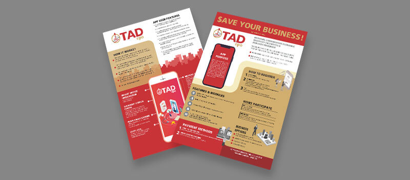
If you’re looking for a way to get more people interested in what you’re selling, try using headings that trigger engagement. Use a bold headline and outline the benefits of what you have to offer. Emphasize the most important details with subheadings or bullet points. Put your contact information at the bottom of the flyer so readers can easily reach out to you if they’re interested in finding out more about what you’re selling. Keep the fonts simple, but make sure they’re readable. And don’t forget to use color! Colorful graphics will help your flyer stand out from competitors’.
6. Clutter-free, With Strategic Use of Blank Space
In order to create an effective flyer to promote your business, it is important to create a clutter-free design with strategic use of blank space. The goal of the flyer should be clear and concise so that the reader can easily understand what is being advertised or what event will take place. You can also add pictures or graphics to make the flyer more interesting and attractive.
There should not be too many fonts or colors on a flyer; instead, you can use one font and one color in order to maintain a professional look. When designing a flyer, it is important not to make mistakes with grammar or spelling.
7. Visible Call-To-Actions Demanding Specific Response
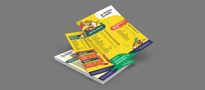
Flyers are a low-cost, effective way of advertising if you want to make an impact on an audience. Make sure your message is clear and concise with visible call-to-actions demanding specific responses. Your call to action should be the focal point of your flyer. The more obvious it is, the better chance you have at getting people to take action. A well-written call-to-action will generate results for your business as long as you do not bury it in text or hide it in the corner. You want to get people’s attention! If they cannot see what they are being asked to do, they won’t do it!
Conclusion
Designing an eye-catching flyer is the first step in engaging with potential customers. Whether it’s for a product, service or event, this marketing tool can be used at nearly any point in the customer journey. If you want to use a flyer as an advertisement, make sure it includes clear and concise messages about what you’re selling.
Språk Design
Our team of graphic designers will work with you on all aspects of flyer production, from creative concept and copywriting to color selection and layout. We know that each project is unique, so we tailor our services according to your needs.
Present Språk Design as a company offering the best flyer design services. We know that each project is unique, so we tailor our services according to your needs.

