9 Flyer Design Tips to Boost Your Advertising Campaigns
Last Update : 1 February 2022
Have the best flyer design? If not, get the right insights into making outstanding flyer designs!
Flyers are an important marketing tool both offline as well as online. They are affordable, versatile, and offer cost-effective solutions. Even in this digital era, both flyer designers and flyers have not lost their importance, and the main reason behind it is that people still love to hold onto things that they can touch.
From clear messaging, striking design, and flawless finish, flyers are a harmonious combination and are both practical and memorable. Find out all about exceptional flyer design services and how you could increase your business benefits through flyers. Gain insights into getting more from flyers using the tips provided by expert flyer designers.
Introduction
A great way of the advertising business is through flyers. Flyers are simple, affordable, and trustworthy, and this is what business needs. In simple words, they are an effective way of promoting business.
What do you do when someone hands you a flyer? Do you throw it away or read it? So if you really want people to hold onto your flyer, then really put in some effort so that it plays an effective role in your marketing campaign. If done well, it is a simple way to bring in numerous customers to your business.
From a compelling headline to presenting your services, your message, or any promotional offer, both the content and design are equally important in a flyer. Therefore, flyers are a perfect fit for business as they help in making a powerful impression among customers in the market.
You can surely do some research on flyer designers too, to design your flyer accurately and use these simple but effective marketing tools to increase your business visibility. If you have doubts, here is some food for thought for considering if flyers are still useful.
Are Flyers Still Useful in 2022?
Are you wondering why flyers have high importance even in this high-tech advertising generation? The very first reason why flyers have worked for centuries is that they are an effective way to get your message across.
Second, Flyers are the most vital marketing materials because of the low-cost option. Also, printed flyers make it easier to share relevant news and offers related to your brand.
Third, people love tangible things. This means even in this online advertising generation; people still like to have something on which they can put their hands. And flyers are great examples as they are mostly of high quality.
Even in this digital world, flyers have not lost their importance. For better understanding, here are some examples-
Personal trainers
Be it promoting new programs, advertising about their qualification or services, or to boot camps, flyers clearly communicate the services offered by the trainers and serve as the most used marketing tool.
Tattoo artists
Another great example are the tattoo artists as flyers help them in promoting their shop and offers. Besides, these materials also help to showcase their art.
Local politicians
Politicians also use promotional materials such as flyers to have clear communication with tens of thousands of voters.
New store
Flyers are great for new store openings as they help you to promote your shop to nearby local people.
Promoting events
Be it an unexpected event for a local political party or charity event, flyers are great for promoting an upcoming event at short notice. However, such urgent needs are fulfilled with the help of the best flyer designers.
Key Elements of Flyer Design
Size
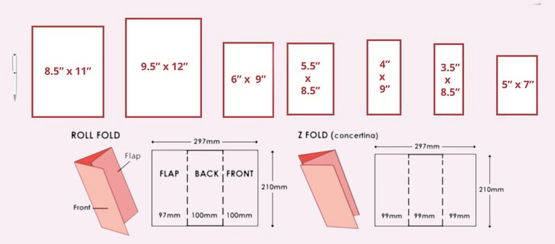
As there are many sizes available, the most common are the A5 flyers. Whether you choose A6, DL or A4, make sure you keep in mind what could be more attractive to your customers. Flyers should be easier to notice and must fit comfortably in the purse.
Shape
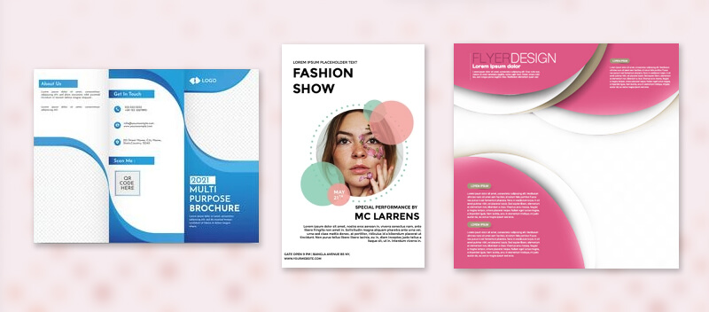
Flyers could contain shapes within them in a way that customers will be able to instantly perceive the intention and objective of the key messages.
Customer-Outcome-Oriented Headline
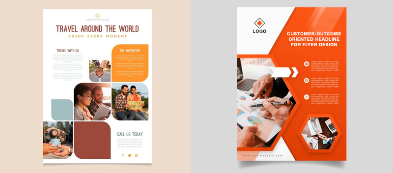
This means the title should be short, centered, and clearly visible. An ideal headline should be 3-4 words. Choose a larger font, centralized text, and try the title to be in a way that it clears what is in the content.
Visual Hierarchy
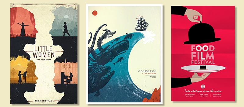
Visual hierarchy is a key element in flyer design. As we know, fonts and colors attract attention. The hierarchy helps create an immediate impact and increases clarity in messaging.
Besides, for the texts, make sure not to use more than two colors. However, for the title, you can use different shades. In simple words, keep your flyer as neutral as possible.
Typography
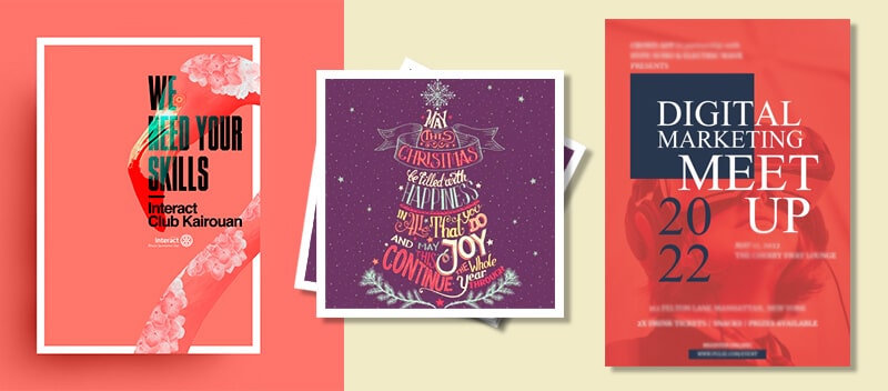
This is another factor to pay attention to. The reason behind this is that different typography styles have different connotations that affect a reader’s perception.
Content, Less But Precise
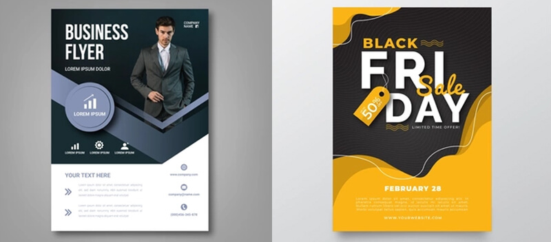
As some mistakes can compromise the effectiveness of the flyer, make sure you know who is targeting and know your goal. So do some research and create the right graphics. Make sure to keep your content less but in a clear and explanatory way.
Design to Showcase Key Points (USP, Offers, Etc)
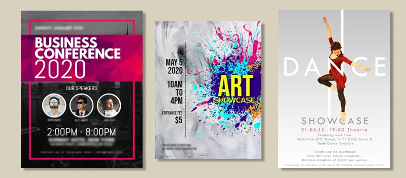
As USP and offers are the core of any public image. So make sure you communicate your own unique selling proposition in the flyer. It should be done in a way that potential customers can immediately perceive the right meaning and take an interest in reading your flyer.
Nine Flyer Design Tips for Boosting Advertising Campaigns
1. Make it one visual message.
If you want your flyer to play an effective role in your marketing campaign, then you need to give one visual message. This means your flyer will have no purpose if you don’t understand the aim behind it, the target audience, and even what message you want to convey.
Both planning about what you want to talk about in your flyer and how you want to convey the message is important like anything else. So make sure your flyer is impactful and also focus on the keywords of your message.
Doing some research before finalizing will surely help you and keep your message tone in line with the customers. Also, keep them interested by rewarding their attention or describing what makes you a better choice than competitors.
2. Align with branding design.
Another tip for boosting advertising campaigns is to align your flyer with branding design. No matter what message you put on the flyer, make sure you highlight your identity. This is important because the reader must know from where the message is coming from.
So if you’re wondering what should be on your flyer, then it should be your tagline, your logo, and your website URL. If you have a brand font or a brand mascot, you can add to make your flyer recognizable.
Also, make sure to avoid any misspelled words or inaccurate contact numbers as it can make your flyer worthless. However, if you want your flyer to be proofread and be consistent with your brand, you can hire any flyer design service too.
3. Use colors that enhance readability and messaging.
If you want to take your flyer to the next level, then make use of colors that are consistent with your brand as well as that enhances readability and messaging.
In simple words, colors that have an eye-catching effect can be the best option. However, if you use a large image, you can choose a subtle yet active color. And even sometimes, less is more, so you can stand out by using a single color.
Besides, make sure you avoid using too many colors as it may end up making your flyer more distracting. Therefore, color plays a major role in making your flyer look more appealing and bolder.
4. Make the headlines attention-grabbing.
Another most often overlooked flyer design tip is to make the headlines worth grabbing attention to so that they can create a strong visual impact. In simple words, if you want people to hold onto your flyer, make it more eye-catching.
However, make sure to avoid the curse of dullness at all costs. So try to balance your flyer using a legible but bold font and logo. However, avoid overcrowding your flyer.
Lettering is the focal point of your blogger, so use the right font and style. No matter what you choose, just make sure your headlines are clean and reflect your brand.
5. Use an Infographic instead of too many images.
As there are many different design elements available, all you need to do is determine what kind of design will match your element. And what can be better than an infographic as it has become a standard visual used in flyers.
If designed well, infographics can communicate information in a highly visual and condensed way. Avoid using poorly designed infographics designs as they may obscure information.
It is also important to keep in mind the story you’re trying to tell before you begin designing your infographic. However, make sure to start your infographic planning with pen and paper or with the help of any flyer design service for better results and designs.
6. Grid it out when there is more than one message.
Another great tip to make your flyer look out of the crowd is to put special focus on the message section. This means you can simply avoid using passive voice and make your flier more attractive using active verbs.
If there is more than one message, use bullet points in a way that is digestible, easy to read, and avoid long paragraphs. Always keep in mind that you have a few seconds to capture the attention of audiences, so don’t clutter your flyer with too much text instead of using grids when there is more message.
This doesn’t mean you shouldn’t stick to conveying your whole message. So use specific terms, descriptions and make sure to speak to your target audiences. However, if you lack knowledge, you can surely seek help from any flyer design agency.
7. Be Minimalistic- Plan the blank spaces.
One of the biggest challenges in designing flyers is the shortage of space. So you need to be more creative about how to layout your design. In such cases, you need to be minimalistic as well as plan the blank spaces in a smart way.
So try dividing your flyer into irregular sections, as this may break up your layers in interesting ways. Avoid throwing a rainbow of bright fonts into the mix and aim for aesthetics that are subtle, calm, and minimal.
In simple words, these are the key elements of a well-designed flyer. However, for a minimal design, you can stick to a white, black, and gray palette. Therefore, keep things simple, yet have a clean appearance.
8. Make images HD, impressive, and relevant.
Another great tip is to make your design optimistic and fun. If you want people to pick up and hold onto your flyer, then don’t make it too serious.
Just like any other thing, the final print is a vital element. To create a great first impression, use a glossy finish and quality paper as it will reflect the quality of your product and services.
However, if you want to appeal to people’s sense of touch, you can opt for a 3D effect. And to make it impressive and relevant, you can consider using different types of folds such as half-fold, tri-fold, and spiral folds.
9. Highlight Call to Actions (CTAs) using visual elements.
Another great thing to do is to guide your potential readers and tell them exactly what to do after conveying your message. This is possible by adding visual elements to your flyer such as the Call to Action button- order now, call now, visit your website, and much more.
This will surely excite them about what they’ve learned on your flyer. Also, make sure that you’re clear with your intentions and how you want them to interact with you. You can also add important details such as contact info, website, location, and more.
This is important to consider as there’s no point in handing flyers for no reason. However, if you’re opting for a flyer design agency, ask them to make your flyer designed in such a way that they feel affordable and inspire customers.
Conclusion
No doubt, flyers are a reasonable way to reach people both for your business promotion or brand products. Even in the coming years, flyers will continue to be the most preferred tool for promotion.
However, if flyers are not done with the right strategy, it can either make everything dull or over the top. So, when it comes to flyers, choosing the right flyer design agency is essential, and one such company is Språk Design.
Språk Design
The Språk Design flyer designers are among the most trusted professionals in this field and have offered services to thousands of firms.
You can surely rely on their skills to reach hundreds of potential customers through amazing crowd-centric flyer designs. Find out the current trend in the market in terms of flyer designing ideas by contacting Språk Design and take your business to the next level!

