10 Amazing Concepts For Web Design That Will Increase Clicks
Last Update : 27 January 2023
A lot of web design is centered around clicks. The more clicks a site receives, the more popular it becomes and the more relevant it is to its audience. If you want to increase the number of clicks on your website, then it’s important to have a good design. There are also some really cool concepts of web design in here, which is great if you’re a visual designer.
There are numerous techniques you can employ to increase the appeal of the link and the likelihood that visitors will click it. As a result, you’ll be able to boost the number of visitors, which could boost sales. Here are ten amazing concepts for web design that will increase clicks:
1. Make Use of a White Background
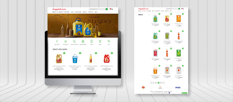
White is a good option if you want your website to stand out and look more appealing. It’s also a good choice because it makes it easier for people to read the content on your site.
Improve user experience on websites by using a white background. It’s also a good choice because it makes it easier for people to read the content on your site.
2. The Animated GIF and Animated Text Transitions
Animated GIFs and animated text transitions have become popular concepts of web design and ways to bring life and movement to a web page. A graphic design company website or a web design company can make use of this technique to improve the user experience on their website.
This can be done by adding subtle motion or transitioning between sections or images on the site. Animated GIFs are a great way to attract attention, draw people in, and keep them engaged. They create visual interest and make a website look more dynamic, adding depth to a design. Additionally, animated GIFs can also be used as an effective way of delivering important messages quickly and effectively.
Overall, animated GIFs and animated text transitions can be invaluable tools for improving user experience on websites. Not only do they provide visual interest, but they also help draw attention to key elements or important messages on the website.
If you’re looking for ways to enhance the look and feel of your web design company website, animated GIFs and animated text transitions could be just the thing!
3. Effective Use of Text Size and Text Captions
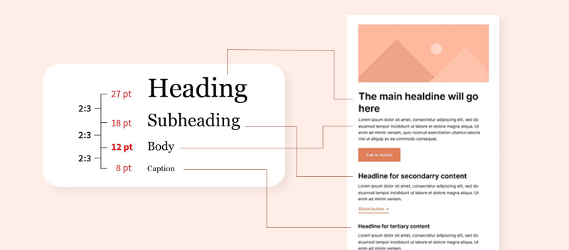
Another important concept of web design is text size. The size of text on a website can have a huge impact on the overall usability and readability of your site. When it comes to selecting font sizes, you need to consider both legibility and readability.
Legibility refers to how easy it is for people to distinguish individual letters from one another when reading a page of text. Readability refers to how easily someone can understand what they are reading.
Consider also text captions; for example, if you have a page that contains a lot of information, it’s not always necessary to show the entire text on the screen at once. Instead, you can use text captions to display only those parts of your content that are relevant to what is currently being displayed on the screen.
This creates an experience where users don’t need to scroll through pages and pages of content in order to find what they are looking for.
4. The Infinite Scroll
Infinite scrolling is an increasingly popular web design technique that allows for endless scrolling of content on a website. It’s becoming widely used by web design firms, as it helps to improve UX on websites. Essentially, infinite scroll eliminates the need for pagination and allows users to keep scrolling until they reach the end of the content.
Graphic design firm websites can benefit from an infinite scroll for a variety of reasons. First and foremost, it allows users to seamlessly move through your site without having to manually click through pages.
It also allows users to access all of your website’s content quickly and easily, without the frustration of having to wait for the page to load.
Additionally, infinite scroll can help to create a more immersive browsing experience, which can be a great way to captivate users and keep them engaged with your content.
5. The Use of Full-Screen Video Background
One of the most eye-catching and effective ways to improve user experience on the website is to include a full-screen video background. This visually appealing feature is becoming increasingly popular for modern web design company websites and graphic design company websites.
The full screen video background provides an immersive experience for visitors to your website. It can be used to communicate your message or business objectives in a very direct and memorable way. It also helps to draw attention to your content while making a big impression on visitors.
The key to using the full-screen video background effectively is to choose videos that are of high quality and consistent with your brand. Make sure the videos are engaging and visually appealing so that visitors remain engaged throughout their time on your website.
For a web design company, a fullscreen video background can be a great way to show off their work and present a portfolio of projects in a dynamic way. You can also use this feature to display customer testimonials and showcase client stories.
The fullscreen video background can really set your website apart from the rest, and make it stand out in the eyes of your visitors. If you’re looking for an eye-catching way to improve user experience on a website, the fullscreen video background is definitely worth considering.
6. Consider Using Textured Backgrounds
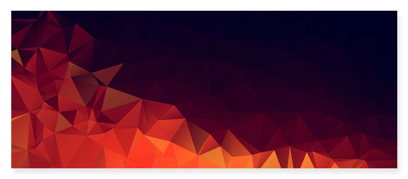
Textured backgrounds are another concept of web design and a great way to add a bit of visual interest and personality to your website. Textured backgrounds are also useful for creating an inviting and warm atmosphere, which can help you establish credibility with potential clients.
7. Overlays Effectively
Overlays are a great way to add visual interest and personality to your website. They can be especially helpful for landing pages, where you want to capture your visitors’ attention and draw them in before they even reach the body copy on the page.
8. Call-to-Action Buttons
You should always have a call-to-action button on your website. This is an essential part of any landing page, and it’s also a great way to increase conversions on your homepage.
A call-to-action button is a link that prompts your visitor to take action, whether it’s signing up for your newsletter or making a purchase. It should be easy to find on every page of your website and should look like a button (rather than just text).
9. Product Images
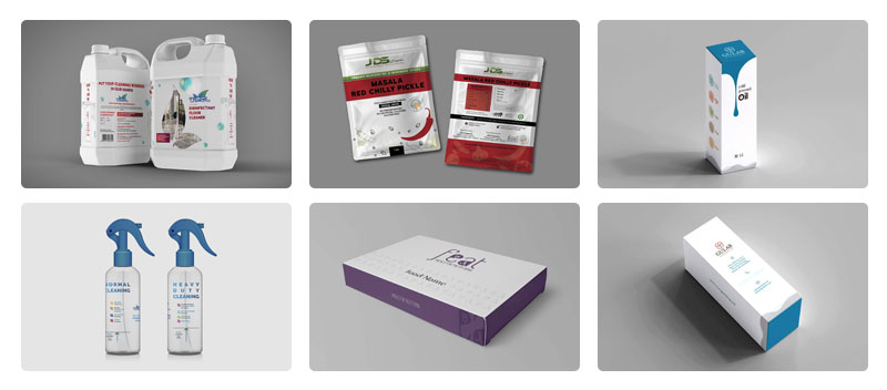
You should have images of your product or service on your homepage. This is especially important if you’re selling something that can’t be fully represented by text alone.
Additionally, it’s a good idea to utilize a variety of photographs so that customers can see how various product designs look in use and have a better understanding of what they’re purchasing.
10. Utilize the Text to Speech Functionality On Your Website
If you have a lot of text on your website, it can be useful to have the software read it out loud. This is especially helpful if you’re selling something that people might not be able to easily understand or if they are visually impaired.
You can also use this feature to explain complex topics that would be hard for most people to understand without hearing them.
Conclusion
The above are some of the most important concepts of web design tips for improving your website. If you want to create a website that converts, you need to work with web design companies who will use all of the tools available to improve user experience on the website of your business.
They will make use of white background, animated GIF and texts, videos and textured backgrounds; effective overlays and call to action buttons will also be utilized in driving more clicks to your website.
By using these tips and techniques, you can create a website that is both visually appealing and easy to navigate, which will help you get more traffic and sales.
Sprak Design
Språk Design is a design solutions firm with a fantastic design team that specialises in generating unique and successful website layouts. We recognise the significance of user experience and design our websites with your target demographic in mind.
Connect with us if you need an online store, a blog, or to update your present website. We will assist you in using the power of incredible web design trends such as gradients to boost the attractiveness and customer engagement of your websites.

